Milan is no stranger to a mainly black third kit, of which there have been some excellent ones in the past. But the home kit is sacred. The same Rossoneri colors that course through our veins should dominate the jersey in our classic and hallowed red and black stripes. Not painted on, not as an afterthought, but as the fabric of the jersey. This year, Puma has failed again, giving us an overwhelmingly black first kit. They had good intentions with the white away kit, attempting to take us back to our Champions League heritage, but literally missed the mark, with stripes that are incomplete and floating in white space. The only kit worth buying is the training kit, which, for the first time ever, is sponsored. Like a team in mourning for having sold out completely, Milan are dressed in black again.
 |
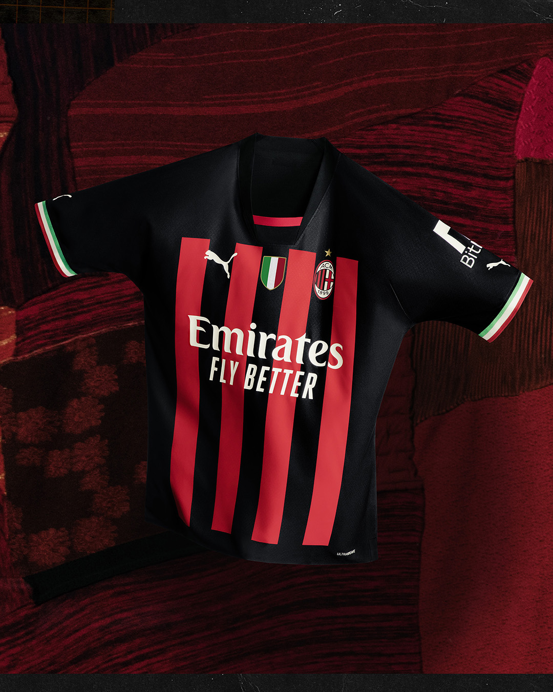
| New game: find the red and black stripes on the home kit |
Our home kit is basically a black kit with a bit of red detail at the front neckline and some tricolore rib trim on the sleeves. The neckline looks like they made a mistake and cut a v-neck too deep and decided to fill it with some extra black fabric trimmed with red. They screened on a large, very squared-off block of wide red stripes on the front, and a tiny rectangle of red stripes across the butt on the back of the kit, leaving a narrow band of black around the hips. That's it. They screened on all of the sponsors logos, the Serie A patch, the club crest, and even the Scudetto patch.
 |
| A bunch of paint on a black shirt |
The back features a dolman sleeve seam (a diagonal seam from the neck to the armpit.) The rib trim from the front of the neck stops at the dolman seams, leaving the back of the neck finished cleanly and a small red rectangular "Sempre Milan" logo screened on for good measure.
 |
| Tiny bits of color on a black canvas |
This kit has a very bizarre design and construction, supposedly designed to reduce seams and therefore a very marginal amount of weight for performance. They designed it so that there is no visible shoulder seam on the top in the front (there is a bizarre dart sew under the arm in the front.) The sleeves are particularly long this year, too, which is bad for most people and terrible for women.
 |
| Puma are no longer designing for the human body, just for fabric weight |
This concept unfortunately makes it like a two dimensional idea of sleeve, which when worn on three dimensional bodies, leaves awkward bunches of fabric under the arms of our players. (Is the weight of the seams really more than the weight of the extra fabric?) It is also more costly in production – the authentic jersey and the replica jersey actually have completely different construction, the replica jersey has a proper sleeve.
 |
| If the players are sitting, how would you even know they are Milan players? |
The amount of black is more than even Adidas' 2016-17 kit, which was also paired with black shorts instead of the traditional white, and seemed like an unfinished funeral kit that was appropriate for what the club was going through at the time. There is even more black than Puma's 2020-21 kit, which with the black sleeves that didn't quite match the screened fabric of the body, seemed like quite a lot of black, too.
 |
| (He has to hold his arms out to hide the bunching under the arms) The original promotional photos were taken before Milan won the league, so do not feature the Scudetto patch. |
In fact, as mentioned on the latest podcast, there is so much black on this kit that the black armbands worn to honor Villiam Vecchi during the Vicenza friendly were virtually indistinguishable, unless they happened to cover up the tricolore trim or the sleeve sponsor logo. It is almost like we are in a perpetual state of mourning. I love a proper black kit, but this one does not feel like a home kit at all. (You can review an archive of all of Milan's kits here.)
 |
| 7 Champions League trophies, 7 stripes, but 0 wins so far |
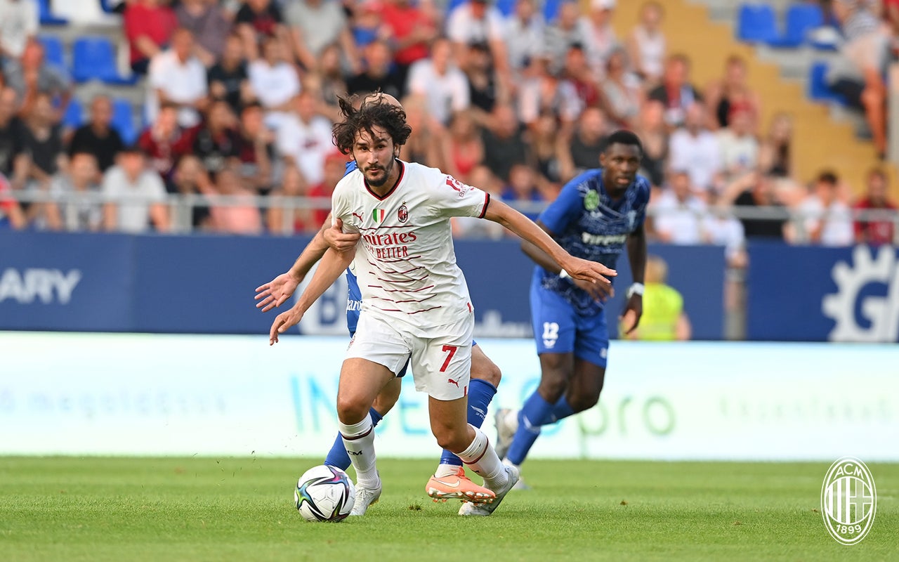
The big draw of the white away kit was the tribute to the seven Champions League trophies Milan has won with a series of seven thin red and black lines across the front of the kit. Only the lines are not long enough, they stop in a very awkward spot, even potentially more awkward for women. The lines seem to be floating on the white kits, almost as if they are unfinished.
 |
| Unfinished lines that float in a sea of white |
The neckline is a simple v-neck, which I always approve of, trimmed with red and black-trimmed rib, as are the sleeves. The logos are all screened on in red, with the players' names and numbers outlined in black to look nice and clean.
 |
| Clean and simple |
This jersey is almost good, but they used the same inexplicably bizarre construction on the sleeves and back. Again, the replica jerseys have normal sleeves and will fit much better, although, like the home kit, the fabric is dryCELL whereas the authentic fabric is ULTRAWEAVE. The ULTRAWEAVE fabric is meant to be lighter for performance, but looks really uncomfortable on our players, sticking to them with the slightest bit of moisture. So unless you are running for speed in your kit, I highly recommend the replica jerseys all the way around.
 |
| Is the weight of history too much for this young team? |
Also, fun fact: so far, the only match Milan have lost was wearing this kit. Even the women lost in their preseason tournament wearing this kit. I'm just saying.
 |
| Not sure this is a shirt worthy of a Ballon d'Or nominee |
Poor Maignan and our other keepers are stuck wearing a cartoonish shade of plum as their second kit, with a stylized screened chevron pattern in black on the front that looks like arrows pointing upward. The Milan crest looks awful on this color, but at least all of the logos are white.
 |
| "If we use a hideous background, the shirt will look better" |
The leaked images of the color of third kit look like a jungle got sick and vomited, and are just not worthy of even discussing. But the training kits are pretty sweet. They are all black high v-necks with rib trim and dolman sleeves and red screened logos. The shirts and shorts both feature screened single perforated grey diagonal stripes on each arm and thigh, with the stripes meeting to form a v on the sleeve. It is difficult to even begrudge the gaudy eFootball logo, because these kits are just athletic and simple.
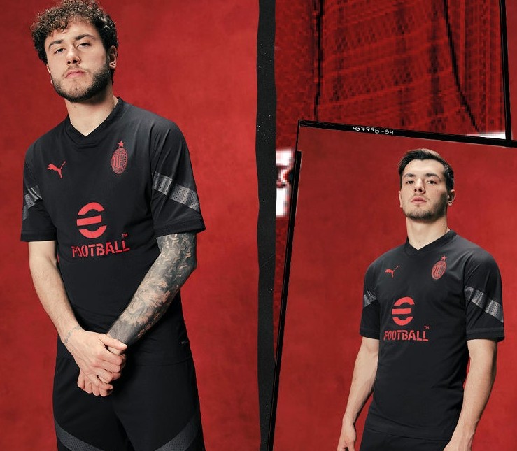 |
| Worth buying, worth wearing |
They say don't bite the hand that feeds you, and with Puma's massive five year deal, I suppose that Milan cannot be critical of the dreadful kits the players are asked to wear or how horribly they fit. But I can. As a fan and a fashion designer, I am personally offended that my team must be subjected to these horrors while they claim they are committed to technology. If they spent half as much time and money on the actual design as they do in the marketing, our kits would be amazing.
 |
| No matter how busy you make the picture, we can still see the kit is mostly black |
It is a shame that our home kits look like some funeral procession met up with a road construction crew painting red lines on them. Our away kits seem more cursed than blessed, and don't even get me started on the hideous third kits. We are the Champions of Italy, and deserve proper kits. But then again, maybe they will disguise how good this young team really is and cause our opponents to become complacent again. We can only hope that our visual suffering is for a good cause as our team is dressed in black again.
This post inspired by the music of Depeche Mode's "Dressed in Black"
Our next match is
 Reviewed by Elaine
on
Rating:
Reviewed by Elaine
on
Rating: