If 2020 has been a bad year for people breathing and catching a deadly virus, it has also apparently been an equally bad year for the people at Puma who design Milan’s kits. I recognize that this is an unpopular opinion, but just know that I see what you people wear 365 days a year, so I am not in the least impacted by your fashion sense. It’s a good thing our team have been playing well, because hopefully no one will pay attention to the fashion crimes that they are being forced to wear going forward.
 |
| If you make it, they will buy |
This post brings together my love of Milan and my experience as a fashion designer. I also have experience as a patternmaker, or the person who takes the designs and transposes them into the puzzle pieces of a garment that are then cut and sewn into those kits that all of you are now buying like people were buying disinfectant wipes and toilet paper in March. Basically, I have the creativity that provides me with the knowledge of design, and also experience with garment construction and techniques, so this review is based more on fashion expertise than personal aesthetic.
 |
| More Duomo, less Galleria |
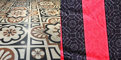
Let’s start with the print. The print was actually originally reported to be inspired by the beautiful floors of il Duomo, the magnificent cathedral in Milano. If you look at the two patterns, this makes more sense than the marketing choice of the Galleria Vittorio Emanuele II, which is right next to il Duomo. The pattern on the kit is nowhere to be found in any of those Galleria images. I assume someone decided the famous shopping center was more politically correct than a church to use as inspiration? Or perhaps they couldn’t get access to take photos in the cathedral? I don’t know why they would change the story, but it does not make me want to give my money to people who so obviously lack transparency.
 |
| What happened here? |
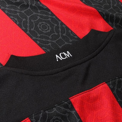
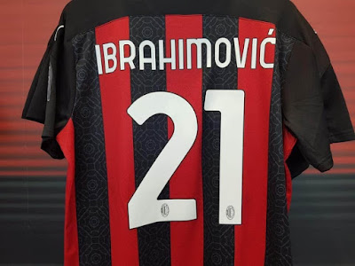
The color on color print on stripes was a beautiful concept. Too bad Puma executed it. The fabric looks shiny and cheap, the colors are off, and the black stripes in no way match the black fabric on the yoke, sleeves, and collar. Speaking of cheap, the front neckline is simply turned and coverstitched, which is a very cheap and also relatively fragile technique to use on a part of the garment that receives so much stress every time it is put on or taken off. Translation: when the stitching at the neck starts coming undone on your kit, you can know that I warned you. The back collar is made of a rib fabric that stretches. This pulls the front tighter to the neck, and may be uncomfortable for some people. But hey, that white embroidered ACM detail on the back of the collar is… something… right?
 |
| Another design element that doesn't match |
The yoke is the fabric that runs across the shoulders to the sleeves. Someone was really looking hard for an original idea here when they extended the yoke to a point a few inches down on the sleeve. This is bizarre. There is no need for it, it does not create a design line that in any way enhances the jersey, especially since it is all in black, and in fact makes it much harder to pattern and sew. It was also poorly executed, as you could see by the way the sleeves puckered and fit the players funny on Saturday. This is also a nightmare for quality control, which means there will be plenty of kits that are less than perfect.
 |
| Cheap and tacky |
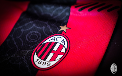
The “vents” on the front at the shoulders and also on the back yoke below the neck look like something on a device bought at Radio Shack in the 1990’s. It is a truly bizarre design element that has nothing to do with anything else going on with this kit. (May I suggest buying the replica kit, which does not have these?) The authentic kits on the Milan store also have a crest that is some sort of a heat transfer, rather than the traditional cloth patch that is appliqued (stitched) on. (The replica and womens’ kits have the patch stitched on… go figure.) I know a lot of fans like the patch as it seems like it is higher quality, particularly for the most important detail of the shirt.
 |
| Why. |
As if this bizarre group of design elements and poor execution were not enough, they took a simple white short and inserted a panel on the sides that is related to, but not the same shape as, the yoke on the shirt. Again, more costly construction and stitching, without any positive design benefits. And they make the shorts pucker and hang funny, too.
 |
| Bloody hell. |
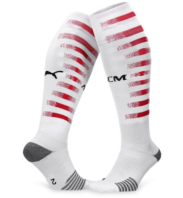
But the random designs would not be complete without the socks. When my son saw them on Saturday, he said they look like bandages with multiple bleeding wounds. And he is not wrong. The brushed red stripes are also a completely different red from the shirt, and once again, a completely different design element from everything else that is going on with the shirts and shorts. Do these people even know what design is?
 |
| After dinner mint? Or recycled Inter kit? |
Poor Gigio is stuck wearing an after dinner mint green kit that was overtaken by a swarm of bees who built their honeycomb on the front. Or, it may have been recycled from last year’s Inter kits of the same color, who knows? I guess using a color that is most commonly associated with baby clothing will highlight his youth. I don’t know what to tell the other keepers.
 |
| When your warmup kit is 100 times better than your first kit |
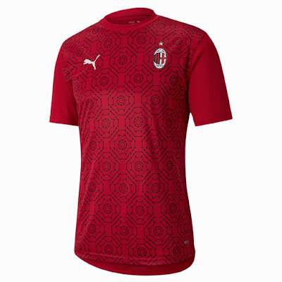
At least with all of the ridiculously unnecessary sewing and construction techniques, you are getting a little more effort for your money than with last year’s ultra-simple kit. But with the cheap fabric that is so shiny and doesn’t lay correctly on the body because it is so poor, do you really want to be seen in it? The design is like if a bunch of designers with ADHD got drunk and just randomly pulled design concepts out of a hat, then made some poor patternmakers and sewing technicians turn the monstrosity into a reality. People will buy it because it is Milan’s kit, and especially because the team is doing well, like we said on the last podcast. Sales are already much higher than last year’s kit. Hype is more powerful than actual fashion sense, especially when it comes to football kits. But with an iron-on crest, it just lacks the Milan class. Or any class, really.
 |
| Not everything with his name on it turns to gold. |
I am the one Milan fan who will absolutely not be buying this shirt, let alone the shorts and socks. I love my team, I love wearing the colors, but my team deserve a better kit than this. Also, I refuse to wear something that is so tacky and so poorly designed, let alone to have to pay $100 for it. Maybe now that Gazidis’ subversive plans to improve the sporting sector failed, he can work on getting a kit that is worthy of our amazing players.
This post inspired by the music of Cake’s “Short Skirt/Long Jacket”
Milan 2020-21 New Kit Review
 Reviewed by Elaine
on
Rating:
 Reviewed by Elaine
on
Rating:
