A lot of transfer talk this week, plus the recent news of
possible cash infusion has Milanisti spirits high. But with only agreements in
place for the investment, the coach, and an expensive player, nothing is
official yet. However there is a reason that all of these good things are
happening, the precursor to all of the potential good news: the new home kit.
Wearing it, the team went two for two, including beating second place Roma.
Which is no surprise after the kits they had to wear all of last season,
because when you’re looking
good, you have confidence. So say what you will about all of the
changes at the club, but I’m going to give some credit for our changes in
fortunes to the new kits.
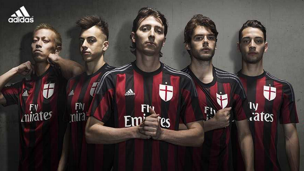 |
| Bleeding red and black in the best sort of way |
What gives the new kits so much power to change Milan’s
fortunes? They are simple, elegant, beautiful. The stripes are the perfect
width, simple, and bold. The red is a deeper, true red, perhaps embodying the
suffering Milan has been through recently, a visual representation of bleeding
red and black. The black band at the hem makes a nice clean finish and goes all
the way around, a nice design theme with all of the kits and other gear this season.
 |
| Keeping tradition close to the heart while moving forward |
I prefer the traditional Milan crest, but at least they have
added a nice detail: the traditional crest is embossed on the St. George’s
cross crest. Which, by the way, people forget is also the flag of Milan, and is
one half of Milan’s traditional crest. Another lovely detail is at the hem,
there is the Italian tricolore, trimmed on either side with tiny colorful flags
to represent the Expo 2015 held in Milano this year.
 |
| Allegiance to country and to the city as well as the global community |
My favorite part is the neckline: a simple crew neck (or
t-shirt neck). Always comfortable, always flattering, always practical. The
element of the new kits that scared me the most when the news was leaked were the
grey Adidas stripes. However, they look amazing. So classy and subtle. Kind of
a gun metal grey that makes them more part of the kit rather than standing out. The
entire kit is the best in years, and then there are the training shirts, the
anthem jacket, and more that are equally simple and classic and fantastic.
 |
| There's that Milan class again |
However, if this kit is not enough for you to look forward
to and you like all of the rumors, here are the leaked pics of the second and
third kits to be officially released when the players return July 8th or 9th:
 |
| Not officially released, but have already been produced - better than most transfer rumors |


So as we wait for everything to become truly official,
giving hope for a better season, at least one thing is already official: we
have a badass new kit. It is already bringing good fortune to Milan on and off
the pitch, and the players look amazing in it. People say that it’s the
investment, the new coach, the new players that have Milan on the up and up,
but I’m giving credit to the only thing that’s official right now: The new
kits. They are why things are looking up.
This post inspired by the power of
looking good
Why Things Are Looking Up
 Reviewed by Elaine
on
Rating:
Reviewed by Elaine
on
Rating:
Reviewed by Elaine
on
Rating: